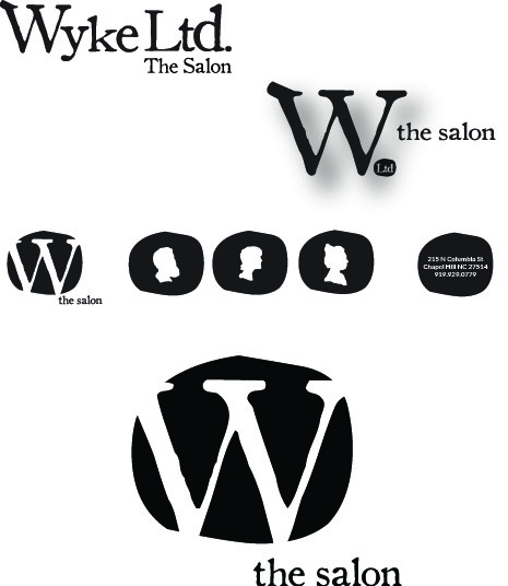
Evolution of Wyke Ltd the salon branding
The salon has grown and evolved gradually over the last few years and because of that, I thought that the logo representing the brand should, too. I knew Greg Wyke wanted the logo to be simple and preferred that the 'W' represent the salon.
I agreed and believed that it would be a process for the salon's identity and PR be a progression of sorts to let the Chapel Hill community learn more about the salon and know who the name represented instead of going the full throttle-Prince-or-the-symbol-formally-known-as-Prince direction.
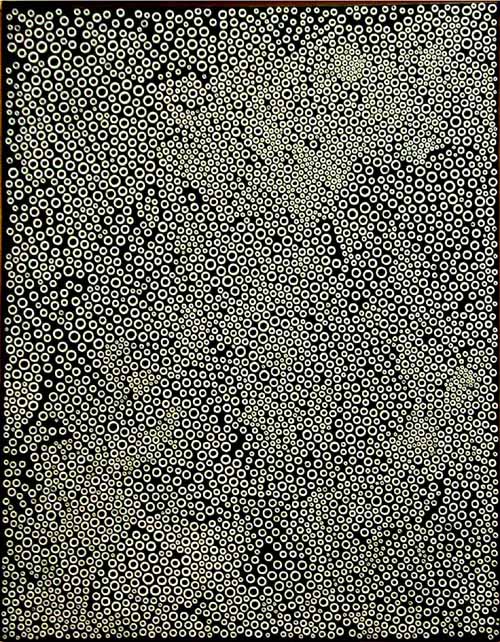
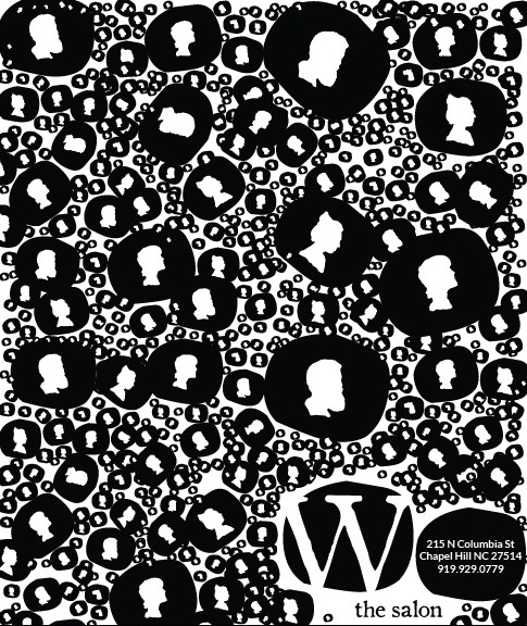
I decided to use the dot in the Ltd. as an activator of space to convey information- either information about the salon, pics, or even as part of the design schema. A HUGE inspiration was Yayoi Kusama and her use of dots in EVERYTHING she does... one in particular was The Galaxy (1994, acrylic on canvas) piece.
Simplification through simple shapes.